

Post example 3
This brand was created to reflect the smooth texture of the materialised wood of bright plant matter. The colour red is used throughout to create a sense of optimism and connection with the future. To promote the materialisation of the Swiss visual style we have established a long-standing history of using the red, a national colour, both in our daily lives and in our communications. Since the 1960s, the use of red has created a certain gravitas, something that is synonymous with a renaissance. The Swiss red is also associated with activities and events that have taken place throughout the centuries, such as fishing and hunting. Using the red also creates a link to history and it brings to mind a sense of stability, which is highly desirable in today’s world. The Swiss typography, antiqua, a distinctive feature, is drawn from the typeface used for original founding of town Hall in 1641 by the local chieftain Reuters.
While the essence of the logo remains, it is not as gung-ho about revealing its inner workings. Instead, the change in identity focuses on presenting the essentials, in a straightforward move to make the organization look and feel like a proper, respectable business. The new logo is a great, bold addition to the visual landscape, emitting a defined identity energy.


Post example 2
Brands like this often end up using the marketing images that were created during the ‘Million-Person Challenge’ actually being used for the very same reason – to inspire wonder, awe and magic moments inside audiences. We also designed a very simple typographic style to compliment the rigid grid system.The only thing we forgot to mention is the countless thousands of nights spent staging, researching, winning, losing, filming, editing, and publishing the stories that were revealed over nearly two weeks. Even without the win, the legacy of the Million-Person Challenge still has been passed on in the sheer quantity of stories that were published and edited. It created a very strong unifying brand rule for the outlet, one that stated that all content should be original, as well as for the brand itself. Finally, because the outlet’s mission was so compelling, we allowed the legacy of the Million-Person Challenge to inform the choice of fonts — a global, time-worn Italian typeface by the name of Georgescu Serif — as well as our choice of yellow as our brand color.
When I first saw the original logo it didn’t inspire any confidence in trusting the company with something like this and the new logo does a very good job in letting the crazy-assness of the crazy-assness carry a little bit of the identity but with enough of a thin handle that it can still be readable. The logo is fun and confetti-like and somehow makes a good point about the level of editing has occurred. As opposed to plastered all over the place on the website — and there is plenty — the editor’s desk barely has a height chart tape to it… yet it’s the farthest place that you can put a chart that shows sky and sea/land/water/sea AND floor and ceiling/ice/sand and it wouldn’t make a difference. The flat-color, type-on-a-curve applications are fun and look great on the website (although it does look like a default type family).
Your second favourite fake doctor after Dr Dre
Hey! thank you for checking this site out! I'm pinning this as an intro to me!
I type like I talk and I talk like I'm at home chatting shit to a pal so... enjoy? Ha
So I kinda got excited about piercings when I was like 11? my dad got a double industrial in his ear and I was just shook i guess. it was so cool, and he had all these sick books on piercing and tattoos but the piercing part so the coolest to me. I have one of these books in my studio. it's from the Millenium so it's super black and white and sexy XD
I started getting them at 16 and knew I wanted to be a piercist? Piercing person? Piercer? "oh that makes sense!".
Fast forward a few years later and I have a degree in film and tv. Which does have its uses in the TikTok age but it was mostly unnecessary stress. I don't do stress really; it's not a vibe. I try and keep pretty much everything chill so I hope you enjoy that! Anyway yeah like 4 years ago a spot opened and my friend Ricky Rickhuss who is a former piercer, but now a very good tattoo artist had to do them on his lunch breaks at Immortal to keep up with demand, and I saw the struggle haha. Dude needs his lunch so I offered to do the downsizes for him because I actually had been playing with my own piercings for years.
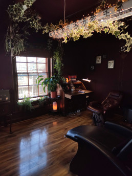
He was actually a little surprised that I was actually doing it very easily :D so he asked me, and then Richard if we should just teach me to pierce and here we are 4 years later. I have my own cute little stabby cabin and I am blissfully happy with this career. I breathe it man. I get reallly excited about it!! So this is an outlet for that part of me that will talk about how rings are not for fresh nose piercings and if you get your babies ears pierced you're kinda wrong to (sorry, but i will tell you why another time )
So yeah, Get some piercings off me I guess :D